ByFahad HosenReviewed by:Yunus A. Polash
Human WrittenWhat Is a Wireframe and Why Is It Useful in UI/UX Design?
Learn what a wireframe is, why it's essential in UI/UX design, its types, benefits, tools, examples, and how to create effective wireframes step by step.
What is a wireframe and why is it useful in UI/UX design? A wireframe is a simple visual plan that shows how the content, navigation, buttons, and other elements of a website or application will be arranged. It helps designers explore ideas, identify usability problems, and agree on the product structure before spending time on detailed visual design or development.
A wireframe works like the blueprint of a building. It does not show every color, image, animation, or decorative detail. Instead, it explains what should appear on each screen, where it should appear, and how users may move through the interface.
What Is a Wireframe in UI/UX Design?
A wireframe in UI/UX design is a basic representation of a digital interface. It normally uses boxes, lines, labels, placeholders, and simple shapes to illustrate page structure and content hierarchy.
According to Figma, wireframes act as basic blueprints that help teams align on requirements and discuss layouts, components, navigation, and interactive elements. Nielsen Norman Group also explains that wireframes can visualize page layouts, user flows, information hierarchy, and interactions.
A website wireframe may show:
- Header and navigation menu
- Hero section
- Main headings
- Text blocks
- Image positions
- Forms and input fields
- Calls to action
- Product or service sections
- Sidebars
- Footer content
A mobile app wireframe may include login screens, menus, profile sections, search features, navigation tabs, notifications, and checkout steps.
The aim is not to create a beautiful interface at this stage. The aim is to create a useful, understandable, and logical experience. Once the basic structure is approved, the team can move toward detailed UI design and interactive prototypes.
What Is the Purpose of Wireframing?
The main purpose of wireframing is to turn an abstract product idea into a visible and testable structure. Team members may understand a requirement differently when it is only explained through meetings, notes, or written documents.
A wireframe gives everyone something specific to review. Designers, developers, clients, marketers, and product managers can see how the planned interface may work before development begins.
Wireframing usually supports four major goals:
- Organizing information clearly
- Planning navigation and user journeys
- Confirming required features
- Identifying usability problems early
This process reduces confusion because teams can discuss an actual layout instead of relying on personal assumptions.
The broader responsibilities discussed in what a UI/UX designer does often include research, user-flow planning, wireframing, prototyping, testing, and collaboration with developers. Wireframing connects these activities by turning research findings into an interface structure.
Why Are Wireframes Important in UI/UX Design?

Wireframes are important because they help teams focus on usability before appearance. A polished screen can attract attention, but attractive colors and images may also distract reviewers from navigation problems, missing information, or confusing user journeys.
A simple wireframe removes these distractions. Stakeholders can concentrate on questions such as:
- Can users find the main action?
- Is the navigation easy to understand?
- Does the content follow a logical order?
- Are important features missing?
- Is each screen connected to the next step?
- Does the interface support the business goal?
This makes wireframes valuable for both users and businesses. The benefits become clearer when we examine how they affect the design process.
Wireframes Clarify the Information Hierarchy
Information hierarchy determines which content users notice first, second, and third. A wireframe helps designers decide where to place the headline, supporting text, trust signals, navigation, and call-to-action buttons.
For example, an ecommerce landing page should normally introduce the product, explain its benefits, reduce customer concerns, and present a clear buying option. Wireframing allows the designer to arrange these elements before working on branding or photography.
A clear hierarchy also supports scannability. Most visitors do not read every sentence on a webpage. They scan headings, images, labels, and buttons to decide whether the page is relevant.
Wireframes Reveal Usability Problems Early
Changes are usually easier to make during the planning stage than after development. Moving a button in a sketch may take seconds. Rebuilding a completed checkout process may require design revisions, development work, testing, and additional budget.
Wireframes can expose problems such as:
- Unclear menu labels
- Missing back buttons
- Complicated registration steps
- Weak calls to action
- Unnecessary form fields
- Poor content order
- Inconsistent screen layouts
Finding these issues early helps the team avoid expensive corrections later.
Wireframes Improve Team Communication
Different teams view a product from different perspectives. A marketer may focus on conversion, a developer may consider technical limitations, and a UX designer may concentrate on user behavior.
Wireframes create a shared visual language. Everyone can point to a specific screen or element and explain what needs to change.
This makes feedback more focused. Instead of saying, “The page does not feel right,” a stakeholder can say, “The pricing section should appear before the contact form because users need that information before taking action.”
Wireframes Support Faster Feedback and Approval
Clients sometimes struggle to evaluate an interface when they only receive a long list of features. A wireframe makes the planned experience easier to understand.
Stakeholders can review:
- Page structure
- Content placement
- Navigation
- Feature priority
- User actions
- Screen relationships
Approval at this stage gives the design team a stronger foundation for creating the visual interface. It also prevents major structural disagreements from appearing near the end of the project.
Wireframes Connect User Needs with Business Goals
An effective interface must support both the customer and the organization. Users may want speed, clarity, and convenience, while the business may want purchases, bookings, registrations, or qualified leads.
Wireframing helps combine these goals. Designers can place useful information around the actions that support conversion without making the interface feel aggressive.
This relationship also affects search performance. The principles described in how UI/UX design affects SEO and website ranking show why clear navigation, readable content, mobile usability, and logical page structure matter beyond visual presentation.
Types of Wireframes in UX Design

Wireframes can be grouped according to their level of detail. The right type depends on the stage of the project and the decision the team needs to make.
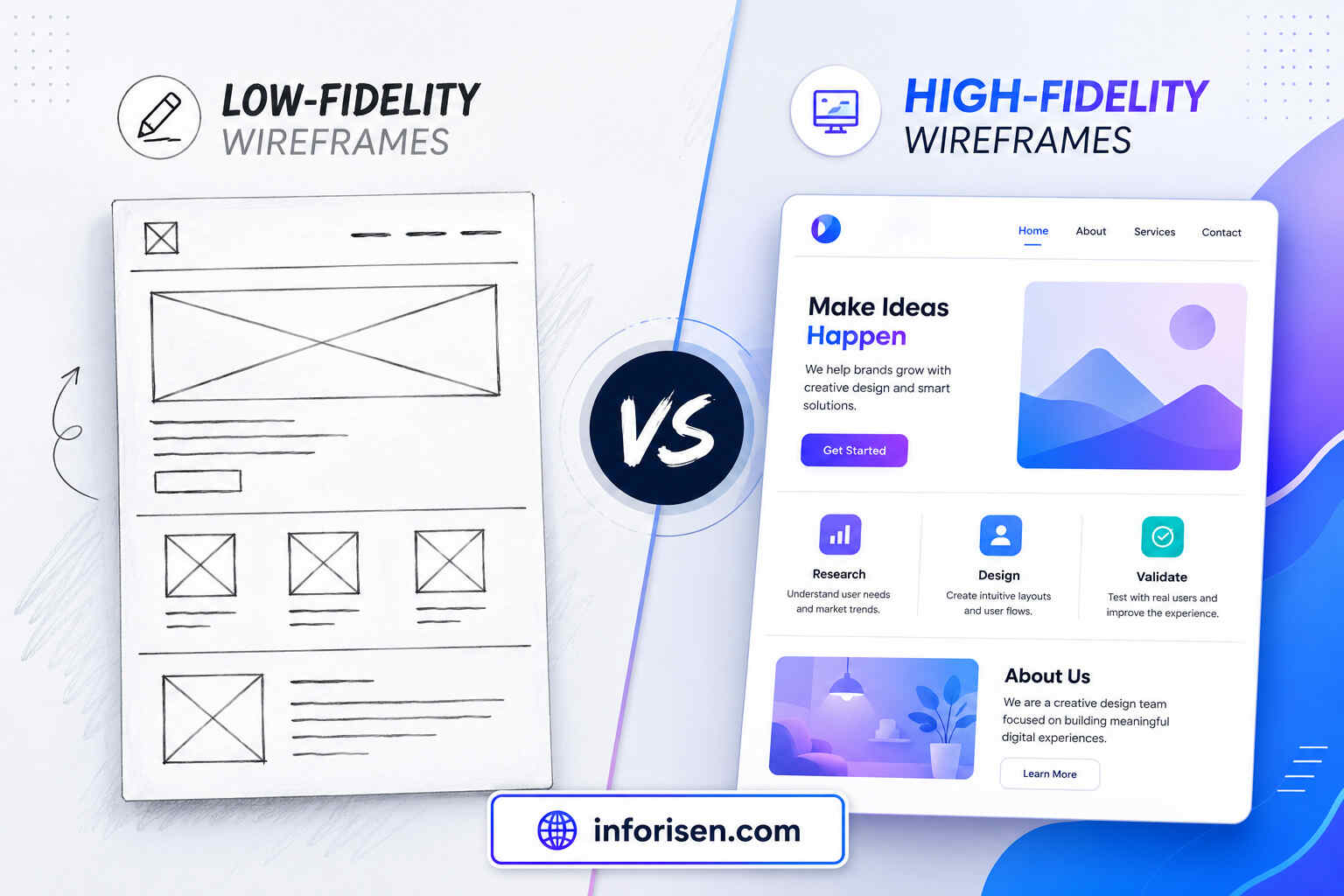
Low-Fidelity Wireframes
Low-fidelity wireframes are rough and simple. They may be drawn on paper, a whiteboard, or a basic digital tool.
These wireframes usually contain:
- Boxes for images
- Lines for text
- Basic labels
- Simple buttons
- Rough screen divisions
- Directional arrows
They are useful during brainstorming because designers can create and replace ideas quickly. A rough appearance also reminds stakeholders that the design is still open to change.
Mid-Fidelity Wireframes
Mid-fidelity wireframes contain more structure and accuracy. The spacing, layout, button placement, and content sections are more defined, although branding and final visuals are still limited.
They may include realistic headings, navigation labels, form fields, and basic interface components.
This level is useful when the team has selected a general concept but still needs to improve usability and content organization.
High-Fidelity Wireframes
High-fidelity wireframes show detailed layouts, accurate spacing, interface components, and more realistic content. They may resemble a nearly completed screen, although they do not always include final branding or full interaction.
They are useful for complex products where developers and stakeholders need a precise understanding of each screen.
However, detailed wireframes take more time to create. Teams should avoid producing high-fidelity work before the main structure and user journey have been validated.
Low-Fidelity vs High-Fidelity Wireframes
Both low- and high-fidelity wireframes are valuable, but they solve different problems.
| Area | Low-Fidelity Wireframe | High-Fidelity Wireframe |
|---|---|---|
| Main purpose | Explore ideas quickly | Define the interface accurately |
| Visual detail | Very limited | Detailed and structured |
| Content | Labels and placeholders | Realistic or final content |
| Creation time | Fast | More time-consuming |
| Best stage | Early planning | Later design stage |
| Feedback focus | Flow and structure | Spacing, components, and behavior |
| Ease of revision | Very easy | More difficult |
| Common format | Paper sketch or simple digital layout | Detailed digital screen |
A project may begin with rough sketches, progress to mid-fidelity layouts, and finish with detailed wireframes. This gradual process prevents teams from investing heavily in an idea that has not yet been tested.
Wireframe vs Prototype vs Mockup
Wireframes, mockups, and prototypes are related design deliverables, but they are not the same.
A wireframe explains structure. A mockup explains appearance. A prototype demonstrates behavior.
| Design Deliverable | Main Question It Answers | Typical Features |
|---|---|---|
| Wireframe | What goes where? | Layout, hierarchy, navigation, content blocks |
| Mockup | What will it look like? | Colors, typography, images, branding, visual details |
| Prototype | How will it work? | Clickable screens, transitions, interactions, user flows |
Wireframe
The wireframe establishes the foundation. It focuses on how information and interface elements are arranged.
Mockup
A mockup applies the visual identity to the approved structure. It may include final colors, typography, icons, illustrations, images, and component styles.
Mockups are usually static. They show how the product may look but do not always allow users to click through the experience.
Prototype
A prototype simulates how the product may behave. Users may be able to open menus, complete forms, move between screens, or test a checkout flow.
Figma describes high-fidelity prototypes as detailed UX simulations that can support usability testing and developer handoff.
These deliverables should not be treated as competing options. They often represent different stages of the same product design process.
How to Create a Wireframe for a Website

Creating a website wireframe should begin with user needs rather than visual trends. The following process keeps the work focused and practical.
1. Define the Page Goal
Decide what the page should achieve. A homepage may introduce the brand and guide visitors toward key services. A landing page may focus on one offer. A product page may help customers evaluate and purchase an item.
A page without a clear goal often contains too many competing elements.
2. Understand the Target Audience
Identify what visitors need, what questions they may have, and what might stop them from taking action.
A first-time customer may need more explanation and trust signals. A returning user may want faster navigation and direct access to an account or dashboard.
3. List the Required Content
Create a simple content list before arranging the layout. This may include:
- Main headline
- Supporting message
- Navigation
- Product or service information
- Benefits
- Testimonials
- Pricing
- Frequently asked questions
- Contact form
- Primary call to action
This prevents important sections from being forgotten.
4. Plan the Information Hierarchy
Arrange the content according to importance. The most useful or persuasive information should not be hidden near the bottom without a clear reason.
Think about the questions users may ask as they move down the page. Each section should answer one question and naturally prepare them for the next.
5. Sketch the Main Layout
Start with simple boxes and labels. Avoid spending too much time on fonts, colors, or decorative details.
At this point, create more than one version when possible. Comparing different layouts can produce a stronger solution than polishing the first idea.
6. Add Navigation and User Actions
Show how users will move through the website. Include menus, links, buttons, form actions, and important paths.
Every major call to action should lead to an expected next step. A “Get Started” button, for example, should connect to registration, booking, checkout, or another relevant screen.
7. Review and Test the Structure
Ask team members or potential users to examine the wireframe. Give them a task and observe whether they understand what to do.
Feedback should focus on clarity, usability, content order, and missing steps. Visual preferences can be discussed later.
How to Create a Mobile App Wireframe
Mobile app wireframing follows similar principles, but designers must work with smaller screens and touch-based interactions.
Begin by identifying the main user task. Then map the screens required to complete it.
For example, a food delivery app may need:
- Welcome or login screen
- Location selection
- Restaurant listing
- Search and filters
- Menu page
- Cart
- Checkout
- Order confirmation
- Delivery tracking
Each screen should have a clear purpose. Avoid placing too many actions in the same view, especially when they compete for attention.
Mobile wireframes should also consider:
- Thumb-friendly buttons
- Bottom navigation
- Screen-to-screen transitions
- Keyboard behavior
- Error messages
- Loading states
- Empty states
- Permissions
- Back navigation
- Different screen sizes
Designers can connect screens with arrows to create a user flow. For more complicated applications, wireflows can combine screen layouts with flowchart-style connections to explain interactions and support collaboration.
Best Wireframing Tools for UI/UX Designers
The best tool depends on the designer’s experience, project complexity, team size, and collaboration needs.
| Tool | Suitable For | Notable Use |
|---|---|---|
| Paper and pencil | Early brainstorming | Fast sketches and idea exploration |
| Figma | Individuals and collaborative teams | Wireframes, components, feedback, and prototypes |
| FigJam | Workshops and user-flow planning | Brainstorming and collaborative mapping |
| Balsamiq | Low-fidelity wireframes | Simple, sketch-style layouts |
| Sketch | macOS-based design teams | Interface design and reusable components |
| Axure RP | Complex systems | Detailed interactions and conditional flows |
| Miro | Remote collaboration | User journeys, flows, and early concepts |
| Adobe XD | Existing Adobe-based workflows | Interface layouts and prototyping |
The tool should not make the process unnecessarily complicated. A paper sketch may be more effective than advanced software when a team is still exploring basic ideas.
For ongoing digital projects, collaborative tools such as Figma are helpful because stakeholders can comment directly on the design. Figma also provides component-based wireframe kits that can speed up website layout creation.
Wireframe Examples for Websites and Mobile Apps
A wireframe should reflect the product’s purpose rather than follow one universal layout.
Ecommerce Website Wireframe
An ecommerce homepage wireframe may include:
- Promotional banner
- Product categories
- Search bar
- Featured products
- Customer benefits
- Reviews
- Newsletter form
- Footer navigation
The product page may contain an image gallery, price, product description, options, delivery information, reviews, and an add-to-cart button.
Service Business Website Wireframe
A service website may include:
- Clear value proposition
- Service overview
- Business benefits
- Work process
- Portfolio
- Testimonials
- Frequently asked questions
- Consultation form
A professional UI/UX design and digital solutions company can use wireframes to connect these conversion-focused sections with the needs of the target audience.
SaaS Dashboard Wireframe
A dashboard wireframe may show:
- Sidebar navigation
- Account information
- Performance metrics
- Charts
- Recent activity
- Filters
- Notifications
- Settings
- Support access
The hierarchy should help users find important information without examining every available feature.
Mobile Banking App Wireframe
A banking app may require:
- Secure login
- Account balance
- Transaction history
- Money transfer
- Bill payment
- Beneficiary management
- Security settings
- Confirmation screens
Because the actions involve sensitive information, the interface should clearly communicate status, errors, confirmation, and the consequences of each action.
Common Wireframing Mistakes to Avoid
Wireframing is simple in appearance, but poor decisions at this stage can affect the entire product.
Adding Visual Details Too Early
Colors, shadows, images, and polished typography may distract the team from structural problems. Begin with the simplest format that can communicate the idea.
Designing Without User Research
A wireframe based only on business preferences may fail to support real user needs. Research, competitor reviews, customer questions, and user feedback should guide the layout.
Using Placeholder Content Everywhere
Placeholder text is useful during early exploration, but realistic content helps teams understand how much space is required. It can also reveal whether headings, labels, and buttons are clear.
Ignoring Mobile Screens
A desktop layout should not simply be compressed into a smaller screen. Mobile interfaces require their own hierarchy, navigation, and interaction decisions.
Creating Only One Concept
The first layout is not always the best one. Creating two or three rough options encourages comparison and prevents the team from becoming attached to an untested solution.
Treating the Wireframe as the Final Design
A wireframe is a planning tool, not a finished product. It should guide mockups, prototypes, usability testing, and development rather than replace those stages.
Can Wireframing Help New UI/UX Designers?
Wireframing is one of the most useful skills for beginners because it teaches problem-solving without requiring advanced visual design abilities.
New designers learn how to:
- Prioritize information
- Build user flows
- Organize content
- Create clear navigation
- Explain design decisions
- Respond to feedback
- Think about user goals
These skills are also valuable for people considering the long-term opportunities discussed in whether UI/UX is a good career in 2030. Tools and visual trends may change, but the ability to understand users and structure useful digital experiences remains important.
Final Words
Understanding what is a wireframe and why is it useful in UI/UX design helps businesses, designers, developers, and product teams build better digital experiences with less confusion. Wireframes make ideas visible, organize information, clarify user journeys, and reveal problems before they become expensive to correct.
A wireframe does not need to look impressive. It needs to explain the interface clearly. When the structure is based on user needs and business goals, it creates a reliable foundation for mockups, prototypes, usability testing, and final development.
Frequently Asked Questions
A wireframe is a basic visual plan of a website or application. It shows where content, buttons, images, navigation, and other important elements should appear before the detailed design is created.
Wireframes help designers organize content, plan user journeys, communicate ideas, and identify usability problems early. They allow structural changes to be made before the team invests in visual design or development.
The main purpose is to define the structure and functionality of an interface. It helps the team decide what each screen needs, how information should be prioritized, and how users will complete important tasks.
A wireframe shows the structure of an interface, while a prototype demonstrates how the interface behaves. Prototypes are often clickable and may simulate navigation, forms, animations, or other interactions.
Early wireframes normally use limited colors and simple image placeholders. High-fidelity wireframes may contain more realistic elements, but final branding and detailed visuals are usually added during the mockup stage.
The time depends on the complexity of the product and the required level of detail. A rough screen can take a few minutes, while a complete high-fidelity wireframe for a complex website or application may require several days.
Yes. Paper, a pencil, sticky notes, or a whiteboard can be enough for early wireframing. Digital tools become more useful when the design needs to be shared, revised, connected to other screens, or prepared for remote collaboration.
.jpg&w=3840&q=75)