.jpg&w=3840&q=75)
B2B SaaS website UI UX audit checklist for Higher Conversions
Explore a complete B2B SaaS website UI UX audit checklist to improve usability, conversions, navigation, accessibility, and user experience.
A B2B SaaS website must explain a complex product, build trust, answer stakeholder concerns, and move qualified visitors toward a demo or trial. This B2B SaaS website UI UX audit checklist helps identify usability problems, unclear messaging, conversion barriers, accessibility issues, and technical weaknesses that may prevent potential customers from taking action.
What Should a B2B SaaS UX Audit Include?
A B2B SaaS UX audit should evaluate the website’s value proposition, information architecture, navigation, interface consistency, mobile usability, page speed, accessibility, conversion paths, forms, trust signals, content clarity, analytics, and user behavior.
Unlike a basic visual review, an effective audit connects design decisions with measurable business outcomes. It should answer three important questions:
- Can visitors quickly understand the product?
- Can qualified buyers find the information they need?
- Can they complete the next step without unnecessary friction?
A SaaS website may look professional while still creating confusion. Buyers might not understand who the software is designed for, how it solves their problem, how much effort implementation requires, or why they should trust the company. The following sections explain how to examine each of these areas systematically.
Start With Business Goals and User Intent
Before reviewing individual buttons, colors, or page sections, define what the website is expected to achieve. Every audit recommendation should connect to a business goal and a user need.
Common B2B SaaS conversion goals include:
- Requesting a product demo
- Starting a free trial
- Creating an account
- Contacting the sales team
- Downloading a guide
- Viewing pricing
- Comparing plans
- Booking a consultation
- Subscribing to product updates
The primary conversion goal should be clear, while secondary actions should support visitors who are not ready to speak with sales.
For example, a first-time visitor may want to explore a feature page before requesting a demo. A technical evaluator may need API documentation or security information. Understanding these intent levels creates the foundation for the audit’s next stage: evaluating the first impression.
Why B2B SaaS Websites Need a Different UX Audit Approach

B2B SaaS purchasing decisions are rarely made by one person. A website may need to satisfy company founders, department managers, technical specialists, finance teams, security officers, and procurement professionals.
Each stakeholder evaluates the product differently. A manager may focus on productivity, while a technical buyer looks for integrations, security, scalability, and implementation details. A financial decision-maker may compare pricing, expected returns, and long-term costs.
This means a B2B SaaS website must support several levels of decision-making without overwhelming visitors. Businesses working with specialists who understand UI/UX design for B2B companies can create clearer user journeys for these different buying roles.
The audit should therefore examine not only whether the interface is usable but also whether the website reduces the customer’s perceived risk.
Audit the Above-the-Fold Experience
The first screen of a SaaS website must quickly communicate relevance. Visitors should not have to scroll through several sections to understand what the product does.
An effective hero section usually answers four questions:
- What is the product?
- Who is it for?
- What result does it provide?
- What should the visitor do next?
Above-the-Fold Audit Checklist
| Audit area | What to check | Warning sign |
|---|---|---|
| Headline | Explains the primary outcome | Uses vague claims such as “Transform Your Future” |
| Supporting copy | Clarifies product, audience, or use case | Repeats the headline without adding meaning |
| Primary CTA | Shows one clear next action | Several equally prominent buttons compete |
| Product visual | Demonstrates the interface or workflow | Generic stock image unrelated to the product |
| Social proof | Establishes immediate credibility | Unsupported claims without logos, data, or evidence |
| Mobile layout | Keeps the message and CTA visible | Text wraps poorly or the CTA moves too far down |
Ask someone unfamiliar with the product to view the hero section for five seconds. They should be able to explain what the platform does and who might use it. When they cannot, the problem is usually positioning rather than visual styling.
Evaluate the Value Proposition and Message Clarity
B2B SaaS customers are not primarily buying features. They are buying faster workflows, lower operating costs, better decisions, reduced risk, improved collaboration, or greater revenue.
The audit should check whether the website translates features into outcomes. For example, “automated reporting” describes a capability, while “reduce weekly reporting work from several hours to minutes” communicates practical value.
Review the website for unnecessary technical language, unsupported superlatives, long introductory paragraphs, and headlines that could apply to almost any software company. Clear language helps users make decisions and makes page content easier for search engines and AI systems to interpret.
A strong page should connect these elements:
Customer problem → Product capability → Business outcome → Evidence → Next action
Once the message is clear, the next step is checking whether visitors can navigate to supporting information without losing context.
Review Information Architecture and Navigation
Information architecture determines how website content is grouped, labelled, and connected. Poor organization forces visitors to guess where important information is located.
A practical B2B SaaS website usability checklist should examine whether the navigation reflects customer questions rather than the company’s internal structure.
The main navigation may include:
- Product
- Solutions
- Industries
- Features
- Integrations
- Pricing
- Resources
- Customers
- Security
- Contact or Demo
Avoid overcrowding the menu with every available page. Group related content logically and use labels that visitors already understand.
Navigation Questions to Ask
- Can users reach important pages within two or three clicks?
- Are menu labels specific and predictable?
- Is the current location clear?
- Does the logo return users to the homepage?
- Is the main CTA consistently positioned?
- Does mobile navigation remain easy to scan?
- Are important pages accessible without using search?
Breadcrumbs can improve orientation on larger resource centres, industry pages, and documentation libraries. Contextual internal links can also guide visitors from educational content to relevant service, feature, or solution pages.
Audit SaaS Landing Pages for Conversion Friction
A UI UX audit checklist for SaaS landing pages should focus on one audience, one offer, and one primary action. Landing pages often underperform because they try to explain everything at once.
Research conducted through large-scale online experiments found a negative relationship between excessive landing-page information and user engagement in the tested settings. This does not mean every page should be extremely short. It means each section should help the user make a decision rather than adding volume without purpose.
Review the following landing-page elements:
- Message match between the traffic source and headline
- One clearly prioritized conversion goal
- Visible and specific CTA
- Benefit-led supporting content
- Relevant product screenshots
- Customer proof
- Objection handling
- Short and understandable form
- Clear post-submission expectations
- Distraction-free navigation
A dedicated campaign page may require fewer navigation options than the main website. The right structure depends on traffic intent, buying stage, and the complexity of the offer.
Examine Calls to Action and Conversion Paths
Generic CTA labels such as “Submit,” “Click Here,” or “Get Started” may not clearly explain what happens next. A stronger CTA reduces uncertainty by describing the action or expected outcome.
Examples include:
- Book a Product Demo
- Start Your Free Trial
- View Pricing Plans
- Create Your Workspace
- Talk to a SaaS Specialist
- See the Platform in Action
The audit should map the complete journey from the landing page to conversion confirmation. Check every step for unnecessary decisions, repeated information, hidden requirements, or unexpected redirects.
The UI/UX design service process should align interfaces, content hierarchy, interaction states, and conversion paths with real user expectations rather than relying only on visual preferences.
Inspect Forms and Demo-Booking Experiences
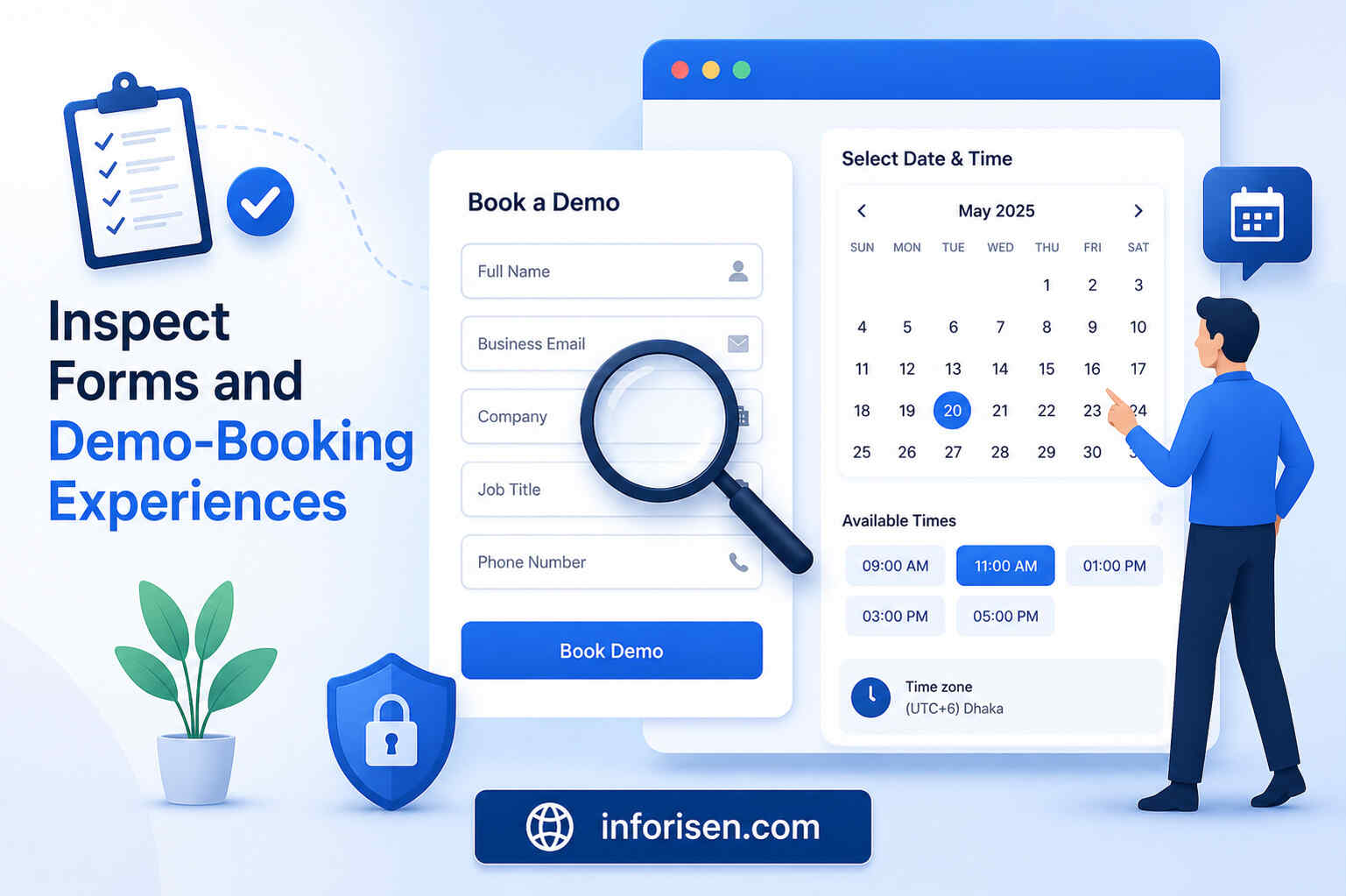
Forms are one of the most important conversion points on a B2B SaaS website. They are also a common source of abandonment.
Every field creates effort and raises questions about why the information is required. Ask for only the data necessary for the current stage of the relationship.
Form Audit Checklist
| Form element | Recommended review |
|---|---|
| Field quantity | Remove fields that are not immediately necessary |
| Labels | Keep visible labels instead of relying only on placeholders |
| Validation | Show errors beside the relevant field |
| Error message | Explain how the user can correct the problem |
| Required fields | Clearly identify mandatory information |
| Privacy | Explain how submitted data will be used |
| Button copy | Describe the action instead of using “Submit” |
| Confirmation | State what happens after completion |
| Mobile input | Use suitable keyboards and field types |
| Calendar booking | Display time zones and available slots clearly |
Test the experience using incorrect data, incomplete fields, a mobile device, keyboard navigation, and a slow connection. The normal path may work while the error and recovery experience remains frustrating.
Check Trust, Risk Reduction, and Social Proof
B2B buyers may worry about implementation time, data migration, team adoption, security, support, contract flexibility, and return on investment. A strong SaaS website recognizes these concerns before asking for commitment.
Trust signals may include:
- Customer logos
- Detailed case studies
- Verified testimonials
- Measurable customer outcomes
- Security standards
- Integration partners
- Product review ratings
- Support availability
- Transparent pricing information
- Implementation timelines
- Data-processing information
- Clear contact details
Testimonials should be specific enough to feel credible. Statements such as “Excellent software” provide less value than evidence describing the challenge, solution, and result.
Place proof near the claim or action it supports. A testimonial about easy implementation is more persuasive near implementation information than in an unrelated carousel at the bottom of the homepage.
Review Pricing and Plan Comparison UX
Pricing pages often create friction when they hide important details or make comparison unnecessarily difficult. Even when enterprise pricing requires a sales conversation, the page should help visitors understand the product’s structure and suitability.
Check whether the pricing experience explains:
- What is included in each plan
- Which limits apply
- Whether pricing is monthly or annual
- How billing changes with usage
- What happens during or after a trial
- Whether setup fees apply
- Which integrations are available
- Which support level is included
- How upgrades and cancellations work
Use a comparison table only when it improves decision-making. Long tables with dozens of nearly identical rows can increase cognitive load. Highlight the differences that genuinely influence plan selection.
Audit Visual Hierarchy and Interface Consistency
Visual hierarchy helps visitors identify what matters first. It is created through spacing, typography, contrast, alignment, grouping, and element size.
During the audit, look for:
- Multiple competing headlines
- Excessive font styles
- Inconsistent button designs
- Weak contrast
- Dense sections without visual breaks
- Unclear clickable elements
- Different spacing patterns across pages
- Decorative elements that distract from content
- Product screenshots that are too small to understand
Create or review a design system covering typography, buttons, forms, cards, icons, alerts, navigation, spacing, and interaction states. Consistency reduces the effort required to understand each new page.
Test Mobile Responsiveness and Accessibility
B2B research may begin on mobile even when final evaluation happens on desktop. A poor mobile experience can remove the product from consideration before a buyer reaches a larger screen.
Test the website at several viewport sizes instead of checking only one phone model. Pay attention to navigation, tables, screenshots, forms, sticky elements, pop-ups, and tap targets.
Accessibility should also be treated as a core quality requirement. Review:
- Text and background contrast
- Keyboard navigation
- Visible focus states
- Alternative text
- Form labels
- Heading order
- Link descriptions
- Video captions
- Zoom support
- Error identification
- Semantic page structure
Accessibility, usability, emotion, motivation, and persuasion can interact as parts of a broader UX evaluation rather than being treated as completely separate concerns.
Measure Page Speed and Technical Experience
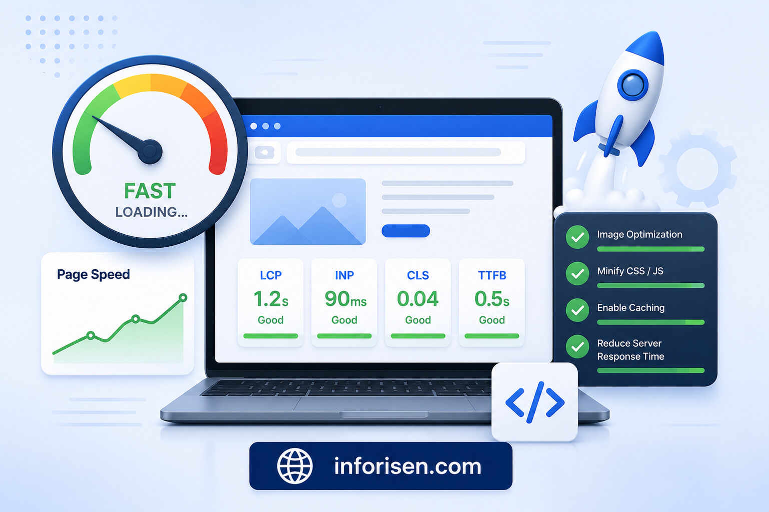
A visually strong website can still create a poor experience when pages load slowly, layouts shift, or interactions respond late.
Include Core Web Vitals and supporting technical measurements in the audit:
| Metric | What it indicates |
|---|---|
| Largest Contentful Paint | How quickly the main visible content loads |
| Interaction to Next Paint | How quickly the page responds to interactions |
| Cumulative Layout Shift | How visually stable the page remains |
| Time to First Byte | How quickly the server begins responding |
| Mobile page speed | Performance under limited device and network conditions |
| JavaScript errors | Broken or delayed interactive functions |
| Form completion errors | Technical failures affecting conversions |
Compress images, reduce unnecessary scripts, delay non-essential resources, use suitable caching, and avoid loading heavy media before visitors need it.
Technical experience also influences discoverability. The relationship between design quality and search performance is explored in how UI UX design affects SEO and website ranking, particularly where navigation, mobile usability, speed, and content structure overlap.
Use Analytics and Behavioral Evidence
A UX audit should not rely only on expert opinion. Combine qualitative observations with quantitative evidence.
Useful sources include:
- Analytics platforms
- Search Console data
- Heatmaps
- Scroll maps
- Session recordings
- Form analytics
- On-site search queries
- Support tickets
- Sales-call notes
- Customer interviews
- Exit surveys
- User testing
Important B2B SaaS metrics may include:
- Visitor-to-demo conversion rate
- Trial signup rate
- Form-start and form-completion rate
- CTA click-through rate
- Pricing-page visits
- Feature-page engagement
- Returning visitor rate
- Conversion rate by traffic source
- Conversion rate by device
- Demo-to-opportunity rate
- Trial-to-paid conversion rate
Do not interpret a metric without context. A high time on page may indicate engagement, but it may also mean visitors are struggling to find an answer. Behavioral evidence helps explain why the number changed.
UX Audit vs Usability Testing
UX audits and usability testing are related but not identical.
| UX audit | Usability testing |
|---|---|
| Conducted through expert evaluation and available data | Conducted with representative users |
| Reviews the wider website experience | Observes users completing specific tasks |
| Can identify established usability problems quickly | Reveals unexpected behavior and misunderstandings |
| Uses heuristics, analytics, and design principles | Uses task completion, observation, and user feedback |
| Produces prioritized recommendations | Produces direct evidence of user difficulties |
The best approach often combines both. Begin with an audit to identify likely problems, then use usability testing to validate important assumptions and observe how target users behave.
How to Improve SaaS Website Conversion Rate With UX
Improving conversion rate does not mean placing more buttons on every page. It means reducing the effort, uncertainty, and perceived risk between the visitor’s need and the desired action.
Use this improvement sequence:
- Identify the highest-value conversion journey.
- Find the biggest behavioral drop-off.
- Review the page for clarity and usability problems.
- Form a specific hypothesis.
- Prioritize the change by impact and effort.
- Test the revised experience.
- Measure the effect on qualified conversions.
- Document the result and repeat the process.
A useful hypothesis might state:
Clarifying what is included in the free trial near the primary CTA will increase trial registrations because users will understand the commitment before clicking.
This is more actionable than simply saying that the page needs a better design.
B2B SaaS CRO Checklist for Prioritizing Findings
Not every issue deserves immediate development time. Use a prioritization framework to separate high-impact problems from minor visual preferences.
Score each finding from one to five based on:
- Impact: How strongly could it influence conversions?
- Reach: How many relevant visitors experience it?
- Evidence: How clearly is the issue supported by data?
- Effort: How much time and cost will the fix require?
- Risk: Could the change create new usability or technical problems?
Prioritize problems that block high-intent users, affect important pages, and are supported by several evidence sources.
For example, a broken mobile demo form should receive greater priority than a small inconsistency in an icon style.
Create a Practical B2B SaaS UX Audit Template
A clear audit report should help designers, developers, marketers, and decision-makers understand what to change and why.
Include these fields in the B2B SaaS UX audit template:
| Field | Purpose |
|---|---|
| Page or screen | Identifies where the problem occurs |
| User goal | Explains what the visitor is trying to achieve |
| Finding | Describes the specific issue |
| Evidence | Includes analytics, recordings, tests, or screenshots |
| Business impact | Connects the problem to conversion or trust |
| Recommendation | Defines the proposed improvement |
| Priority | Sets urgency based on impact and effort |
| Owner | Assigns responsibility |
| Status | Tracks implementation |
| Success metric | Defines how improvement will be measured |
Avoid recommendations such as “make the page modern” or “improve the UX.” Each recommendation should be specific enough for a team to implement and evaluate.
Businesses that need design, development, and digital strategy support can work with a multidisciplinary software and digital solutions company to address both interface problems and the technical systems behind them.
Final B2B SaaS Website Usability Checklist
Before completing the audit, confirm that the website meets these essential requirements:
- The target audience is immediately clear.
- The main value proposition focuses on customer outcomes.
- Navigation labels match user expectations.
- Every major page has a clear purpose.
- Primary and secondary CTAs are visually distinct.
- Forms request only necessary information.
- Product screenshots demonstrate real workflows.
- Pricing and trial conditions are understandable.
- Trust signals support important claims.
- Security and implementation concerns are addressed.
- Mobile layouts work across screen sizes.
- Keyboard users can access interactive elements.
- Pages load quickly and remain visually stable.
- Analytics track the complete conversion journey.
- Recommendations are prioritized by evidence and business impact.
Final Words
A successful B2B SaaS website UI UX audit checklist does more than identify unattractive sections. It reveals where customer questions remain unanswered, where trust breaks down, and where unnecessary effort prevents qualified buyers from converting.
The most effective audit combines expert evaluation, analytics, customer feedback, accessibility checks, performance data, and usability testing. When the findings are prioritized and connected to measurable outcomes, the website becomes easier to understand, easier to use, and more effective at generating qualified SaaS leads.
Frequently Asked Questions
A B2B SaaS website UX audit is a structured evaluation of usability, messaging, navigation, accessibility, performance, trust, and conversion paths across a software company’s website.
A complete audit is useful every six to twelve months. Additional reviews should follow major redesigns, product changes, conversion declines, or significant changes in customer behavior.
It should include business goals, user journeys, navigation, page hierarchy, messaging, calls to action, forms, pricing, social proof, accessibility, mobile usability, performance, and behavioral data.
A focused audit may take one to two weeks. A large website with research, user testing, analytics analysis, and many product pages may require several weeks.
Yes. An audit can reveal unclear offers, weak calls to action, difficult forms, missing trust signals, navigation problems, and other barriers that reduce qualified conversions.
An audit identifies and prioritizes problems. A redesign changes the website’s structure, interface, content, or visual system based on evidence and defined business objectives.
Usability testing is strongly recommended for high-value journeys. It validates audit findings and reveals problems that analytics or expert reviews may not identify independently.
.jpg&w=3840&q=75)